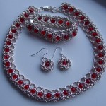
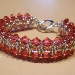
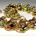
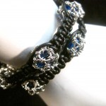
At the end of last year, Blue Buddha’s founder Rebeca Mojica made the leap to launch her own brand, focusing on her finished chainmaille jewelry. In this post, she talks about why she decided to do this and offers tips for getting the most bang out of your branding, even if you’re on a shoestring budget.
Have another question for Rebeca on this topic? Leave it in the comments, post it to our page on Facebook or send it in an email to [email protected]!
What made you decide to start the Rebeca Mojica brand rather than continue to sell as Blue Buddha?
Over the years, people have come to recognize Blue Buddha as a supplier of premium jump rings and instructions. The brand began as an artisan jewelry design company, but evolved into a jewelry supplier. When people hear the name Blue Buddha Boutique, they may think of innovative chainmaille designs, but they think in terms of “That’s something I can learn to make from Blue Buddha!” as opposed to, “I want to buy a completed version of that necklace!”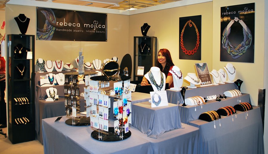
I had been contemplating this move for a few years. What finally sealed the deal was an art fair I did in the winter of 2010. Every single day of the four-day show, people came to my booth asking to buy pliers. I realized the time had come to make the switch once and for all so that I could have a jewelry brand that could stand on its own.
Is it common for larger brands to have subbrands?
Large companies almost always have sub-brands and/or multiple “divisions.” Actually, it’s a little creepy how big some of the huge corporations are, once you add in all their holdings, but that’s another topic. *chuckle*

What is more common in the artisan world, is for a designer to have two or three brands, each serving a different market. For example, some jewelry designers create high-end pieces that sell in museum shops and luxury boutiques. However, they still wish to make pieces for the “masses.” Unfortunately, if they were to sell high-end items right next to much more accessible items, it could dilute the brand. Customers might be confused: “Is this a luxury brand, or not?” Worst-case scenario, the mixed-message could lead some customers to avoid purchasing items from this designer.
So the solution is to have a secondary brand, possibly even one that allows the designer to sell directly to the customer via craft fairs, a company website, or an online marketplace such as Artfire. The prices for this brand can be lower because the middle men, if there are any, take a much smaller percentage than galleries and reps, who combined can take much as 70% of the retail price. If artists were to sell both lines under the same name, then the galleries would likely feel as though they are being undercut because customers could simply go to the artist’s website and purchase a similar piece for half the price.
Having multiple brands allows the designer to create distinct product lines that appeal to different tastes and budgets. Additionally, some artists like to take more chances with subbrands, because if something “bombs” it won’t affect their meat-and-potatoes line. Some designers use a subbrand to support controversial causes or non-traditional lifestyles; they can do so without ostracizing their core customer base. I know more than a few artists who successfully sell their work under a couple of different names, each with their own branding, and each targeting a different market.
Where you at all nervous about making this switch?

Truthfully, I was far more excited than nervous. It was like starting a business all over again, but with much more clarity and vision than the first time I started a business. I got to concentrate on all the fun stuff: new business cards! New logo! New tagline! The creative part of my brain loved it!
I was also reassured because I knew I already had a customer base; I wasn’t trying to start a jewelry line from scratch. I knew that having a jewelry business can be tough, and part of me half-expected to hear crickets chirping after we sent out our first official email announcing the Rebeca Mojica website. But instead, we were overwhelmed with emails of support … and of course, orders for jewelry! Yay!
How did you decide what colors would represent Rebeca Mojica brand?
First off, I knew I wanted nothing to do with the blues and lilacs that are associated with the Blue Buddha brand. I figured if I was creating an entirely new line, it needed to be distinguishable. I wanted a palette of three basic colors so that we could mix and match for the website and other branding materials. From the three basic colors, each color would have one additional tint/shade that would be the exact same hue, just a lighter or darker version of it.
 Gray was an obvious choice, because I work with metal. OK, one down.
Then, on to the difficult part of choosing another two colors to go along with the gray. Jenna, my marketing gal, and I read dozens of articles about color theory and choosing colors to represent brands. We read studies about what perceptions people had regarding colors (including A Guide to Choosing Colors for Your Brand and Colorize Your Brand). We looked at hundreds of photos of home decor in various color palettes. It was fascinating, but also easy to get a bit overwhelmed with analysis.
The next color we chose was a chocolate brown It is a good, neutral color, and to me, it’s also very organic. Even though I’m not making jewelry out of wood, I still think many of my designs have a real organic feel to them, and I am always inspired by the shapes I see in nature and the fractal-esque form of trees. The deepness of the color is elegant, as is much of my jewelry. It is also suitable to represent men’s jewelry, which is important because I plan on developing a men’s line later.
Having chosen two earth tones, I wanted just a splash of brightness to counter the neutral tones of the gray and brown. The deep red we selected represents the color used in my work. The way I use color is sometimes daring, sometimes whimsical, but almost always attention-grabbing. And the color red says all of those things to me. Also, I admit that I adore goth fashion and so red’s appearance in my branding wasn’t a complete surprise. *grin*
Once we had the basic colors nailed down, Jenna created a few different variations on the theme (okay, more than a few – see them to the right) so we could compare exactly which hues we liked best. Should the red be more on the orange side, or violet? What about the gray? Warm gray, or cooler, almost slate? We played around for a bit and settled on the final colors that you see on our marketing materials today.
As a post note, it’s funny that after we choose the colors (we ended up going with palette #3 – shown right), I later realized that the gray really had a huge blue undertone. “But I was trying to stay away from blue!” I agonized. Ultimately, though, after looking at other warmer shades of gray, I realized our shade really did work the best … and no one could possibly confuse it with the blues used in the Blue Buddha branding. So I had to let this one go, and I’m glad I did, because now I really love the colors of the Rebeca Mojica brand.
Do you think it’s important to have a logo? What if I’m not a designer, what should I do to create one?
If you are more than a hobbyist, and wish to earn actual income from your craft, then yes, having a logo is crucial. You’ll want to use your logo on your marketing materials–your website, business card, jewelry tags, care sheets, banners at shows, etc. If you have a clever, memorable logo, you’re more likely to get repeat customers. And if you do the same craft fairs year after year, you’re more likely to get new customers, too, for the simple fact that people will remember seeing your logo and work, and will feel as though they can “trust” you because you’ve been there for several years.

At this point in my business, I’m lucky to have Jenna as a full-time marketing person. With some input from me, she created the Rebeca Mojica logo and tagline, and created the clever interlocking circles above my last name (which I adore). Obviously the vast majority of artisans will not have a full-time marketing person, or even a contractor, to handle a logo design. We are, however, strongly visual people and many of us will be lucky enough to create a strong logo on our own. Even if this is you, however, I do recommend eliciting feedback from friends, current customers, and peers whom you respect. Sometimes your vision doesn’t shine through in your logo, and you’re too close to it to notice a potentially humorous or confusing flaw.
If you can’t design your own logo, see if you have any friends or current customers that can do it for free, or in trade. When I originally did the Blue Buddha logo, I knew what I wanted, but didn’t have the skills to make it real, so I found a friend in design school who did it for me. The deal we worked out was $50, some beer and a piece of jewelry for his ladyfriend. Nine years later, that was money clearly well spent.  We still have a design credit to him on our website to this day.
If you don’t have any design friends, then try going to your local college–or if you’re really rural, try the local high school. Nowadays, many students can do amazing things on computers. Yes, you’ll have to spend money on this, but if you’re working with a student, your investment will be minimal, and sometimes a student might even be willing to do it for free (or in trade) in exchange for being listed on your website as a resource. With any luck, you’ll connect with an exceptional person with whom you can work with again later on other projects you may need.
If you have someone else create your logo, be sure to have some idea of what you want, and what you don’t want. Designers aren’t mind readers. If there are colors you want used, be sure to say so and to state why. If you feel specific motifs represent your brand, let them know. Bring in examples of fonts you like and fonts you don’t like. All of this will help the designer develop a logo that you like sooner, rather than later, and it can save you both much frustration. If you have a really good idea of what you want your logo to look like, you can even try sites like 99 Designs where you describe your exact specifications and receive design ideas and quotes from tons of designers affiliated with the site.
Finally, make sure you have a couple of versions of your logo that can be used. I’ve found it is best to develop a square one as well as a horizontal one. That way, if your horizontal logo is too long for your jewelry tags, the square one may be perfect. This gives you greater flexibility with your promotional materials.
You are always great at making a big impact on a small budget. For crafters, what branded items do you think give the biggest bang for the buck?
1. Website (or logo if you are on an online marketplace, like Etsy or Artfire or even just Facebook) — in today’s age, you need to be online, and you need to make sure your brand shines though on every page of your site. I used IndieMade to create my site and highly recommend them for folks who need their own website and want to be able to start selling things right way.
2. eNewsletter – It is never too early to start a newsletter. (My first mailing only went out to a list of 6 customers … but they didn’t know that!) Some mailing list services like MailChimp even offer free plans for lists of less than 2,000 names. Every time I do a mailing with a promotion, we get jewelry orders. Without fail. So what are you waiting for? Get to it! (Click here to join Rebeca’s email list and find out when the next sale is! Enter your email address and select “Rebeca Mojica Jewelry” from the list choices on the next page.)
3. Care Sheets – Care sheets can be super inexpensive–ours are simply 1/3 page double-sided black and white copies. If you put enough useful information on your care sheets, customers will keep them. Which means they’ll see your name over and over again, and every time they refer to the sheet, they’ll be reminded that you are a trustworthy source of information. Keep a digital copy of your care sheet online–this is useful not only for customers, but it can increase traffic to your website if other people are searching for how to care for an item.

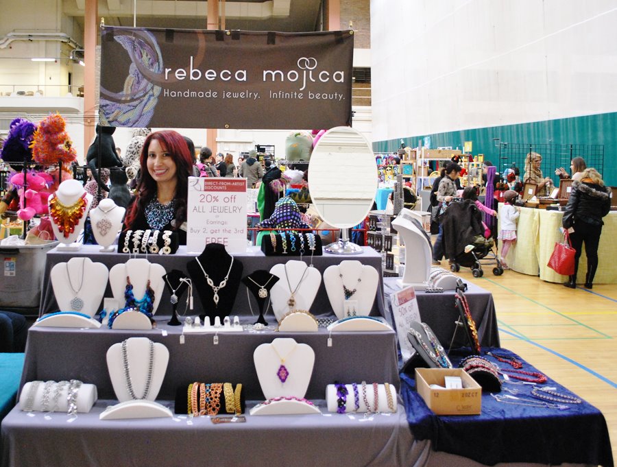
4. Banners for craft shows – If you do shows, you need a banner to grab people’s attention. You want someone who is walking down the aisle to see your banner and think, “Man, I gotta get to that booth right away, even if I skip this next booth!” Make sure to have a banner that is displayed over your head, rather than hanging off your table. If you’ve got a crowd of people looking at your stuff (and you do want a crowd of people looking at your stuff, right?), then no one will be able to see your banner if the only one you have is on the table, hidden behind everyone’s legs!
5. Business cards — Note that business cards didn’t even make it into my top 3! That’s because we live in a digital age, and the paper business card is not as important as it used to be. Sometimes at craft fairs, people just go around gathering business cards…and then never look at them again. So you don’t need to spend a lot of money on your cards. If someone is interested in your stuff and grabs your card, it doesn’t need to be the most spectacular thing they’ve ever seen. It just needs to have enough information (including images) to remind them what you make, and then they’ll probably just go to your website anyway… and then throw away your card. If you don’t have a designer, using a site like Moo cards can make the post of the images you do have along with your logo (they also have lots of modern premade designs to choose from!)
What can we expect from Rebeca Mojica brand jewelry as you continue to develop its new identity?
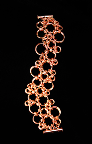
 I’m looking to dive more into the Japanese family of weaves. I’ve already started creating several pieces that will make up the Bubble collection…essentially large statement pieces with lots of white space that look like, well, bubbles! I’m looking to develop a few new lines at different price points. And, I plan to come up with 1-2 haute couture pieces (think Poseidon’s Embrace) each year. There’s a few ideas for chainmaille clothing that have been tugging away at my brain for a few years, so I expect they’ll start to take shape–literally–over the next couple of years.
I probably won’t get too deep in making many new jewelry designs for about a year and a half, as I’m about to start work on a second instructional book, and that is going to take quite a bit of my attention. (Hmm, not to mention being preoccupied with opening up a new retail space for Blue Buddha Boutique … ) However, as soon as the second book is finished, lookout! Because then I’m all about making new designs! In the meantime, though, there are a lot of pieces I’ve made and sold at shows, but have never put online. Each month, we’ll be adding several of these to RebecaMojica.com, which means there will still be plenty of eye candy for you!






 We still have a design credit to him on our website to this day.