A Decade of Chainmaille

Ten years ago, on this day, I made my first piece of chainmaille.  *squee!*  At that time, I didn’t realize that my life would never be the same. I certainly didn’t imagine I would be where I am today.  It’s been an amazing journey, and I’ve learned so much from my students, customers, co-workers and fellow chainmaillers.

Here’s a little glimpse into how I fell down the rabbit hole 10 years ago:

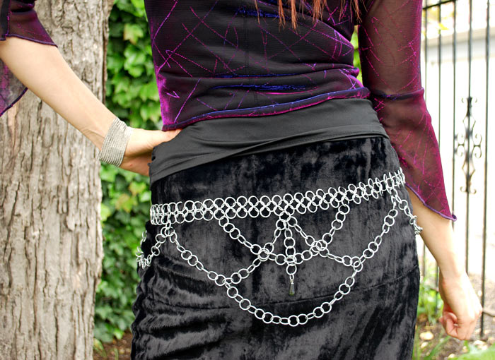
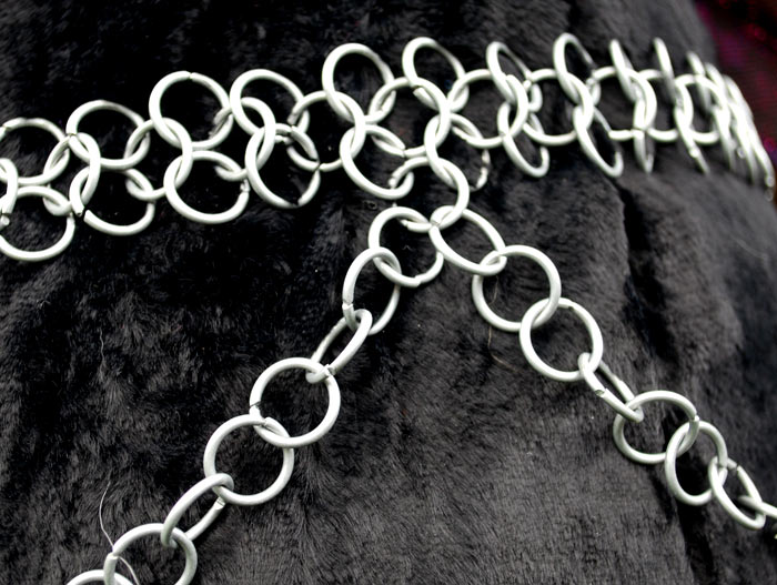
I’d fallen in love with a chainmaille belt I saw someone wearing at a Renaissance Faire in Germany.  I couldn’t find any to purchase that I’d liked, either there, nor when I returned home. But I did find an eBay listing for “1,000+ rings! Make your own chain mail!”  I figured I didn’t have anything to lose, so I bought the rings.  They turned out to be 16ga galvanized steel.  Oy.  I am lucky those rings didn’t scare me away, but instead, somehow caused me to fall in love with this artform.

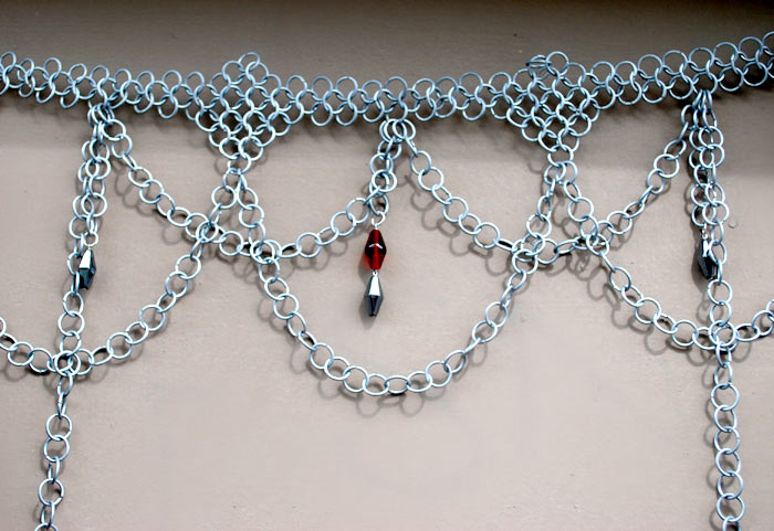
Euro 4-in-1 chainmail belt

The very first piece of maille I made. I didn't follow any instructions; my fingers just instinctively knew what to do. My technique and speed, however, were a different story. ;-)


galvanized steel chainmaille

I had enough rings leftover to make a second belt. This one hasn't survived as well as the first one; somehow parts of it were cannibalized for other projects during the early parts of my mailling career.

making chainmaille with unusual tools

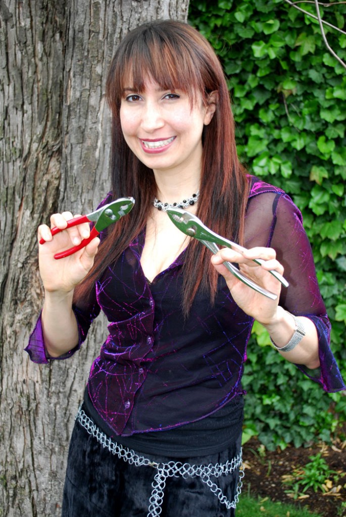
With no proper pliers around, I improvised. Yep, the desire to create maille out of that first pack of jump rings was too great. I couldn't wait to get started, so I used these li'l guys!


poor closures in chainmaille

Oy. I cringe looking at my first closures and non saw-cut rings.


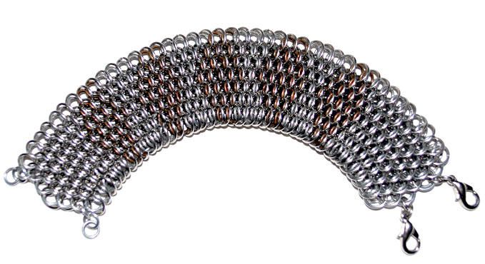
20ga dragonscale chainmaille

Typical chainmaille insanity: I taught myself Dragonscale about 2 1/2 months after I started making maille, using, of course, 20ga rings! This is I20 SSTL with D20 ALUM/COPP — 20ga 13/64" (5.2 mm) stainless steel with 20ga 1/8 (3.2 mm) aluminum and copper.


Over the past 10 years, I’ve seen the industry really blossom. Maille seems to be everywhere these days, and there are some fiercely talented folks out there. I’ve seen some chainmaille artists, and even several suppliers, come and go (*sniff*). I’ve watched the number of known weaves documented on M.A.I.L. soar from 200(ish) to more than 1,100. I’ve spent more than 1,000 hours teaching thousands of students how to make maille.  And I gotta say – I still love what I do every bit as much as I loved making that first belt.

Thank you to everyone who’s helped me along the way: artists who’ve taught and/or inspired me, and stores and galleries who took a chance on a new artist/instructor—including Spider, Maillemaster, Emerald Dragon, Buddha, Zlosk, Sarah Chapman, Caravan Beads, Lillstreet Art Center, Aesthetic Eye — the Chicago Craft Mafia, the talented and hard-working crew of anyone who’s ever worked for B3, every single customer and student we’ve had, and many others. I am eternally grateful.

For more of my early work, see the post celebrating my 8-year anniversary of making maille.

Congratulations to April’s Featured Product Contest Winner!

Voting for April’s Featured Product of the Month contest is officially closed and the winner as chosen by you is……


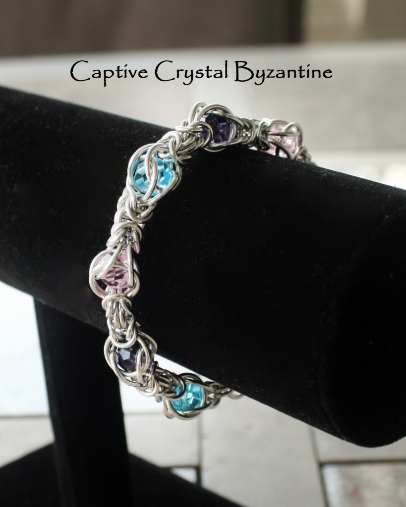
Chrys M. with his piece “Captive Crystal Byzantine”!


Congratulations, Chrys! Your creativity has earned you a B3 gift certificate for $25! To claim your prize, please send an email to [email protected].


A Note about April’s Contest:  Some of you noticed that, while the contest was meant to be for projects that used round crystal beads, some of the projects that made it to the final voting used bicones.  This was an oversight on our part and we want to extend apologies for confusion or hard feelings about this.  In our enthusiasm to get the finalists together, we made the mistake and didn’t realize it until public voting was already underway.


Taking down the survey to replace it with just the entries who used round beads could have resulted in some of those losing the votes they had already gathered.  In the end, the entries using the bicones were not eligible to win, but it didn’t much matter anyway as Chrys’ piece did come in first regardless of our error.  We have established a better process for looking over the submissions so we don’t run into this again.  Thanks for understanding!

All of that said, we still want to sincerely thank ALL of April’s contest participants – the projects we received were each inspiring no matter the shape of the crystals! We are currently accepting submissions for May’s contest. Dazzle us with your use of stainless steel rings for your chance to win!

Happy Weaving!


Featured Product Contest: May 2012


For May, it’s all about bringing out the big guns. Stainless Steel may not be for the timid but that doesn’t mean it can’t be tamed into something truly delicate and beautiful. We recently replaced our stainless steel stock with rings made from a much easier to manipulate wire, so if you’ve been intimidated in the past, now might be the time to give it another try. If you you’ve never worked with stainless steel before, we recommend playing around with the rings in our Try Before You Commit pack.

Note: If you liked the wire we were using before, check out our Stainless Steel sale – it will only be up another week or so, so don’t hesitate!

To see what this metal can really do, we recommend checking out this post featuring Melissa Banks – a well known steel wrangler – or visit Rebeca’s website for a few images of steel pieces she has created (like the one to the left.)


HOW TO PARTICIPATE:


Make a project which primarily uses our featured product. The project can most definitely use other rings and components, but the featured product should really be the star of the piece. Please see the complete rules and details below for more information about qualifications.


Take a picture of your project and submit it using our official Featured Product Contest form (link below.) You may post the piece online somewhere and provide us with a link, or upload it directly in the form. You will be asked to provide your name and an email address we can use to contact you in case anything goes wrong with your submission—or if you are the winner of the contest!

GO TO THE SUBMISSION FORM

Submissions are closed at midnight CT on 15th of every month and are limited to 2 entry pieces per person.


Get Votes! Submissions will close on the 15th of each month at which point the B3 Staff will choose our favorites. The top entries will be eligible for voting through a survey which we will post to our blog. If you are one of the finalists, feel free to share the link with friends via email, Facebook, Twitter or any other means.

Voting will close on the last day of the month.


We will award the top voted finalist each month with a $25 B3 Gift Certificate and will feature YOUR project in a special blog post and possibly even future B3 ads to inspire fellow chainmaillers all over the world.


Complete contest rules and details: Submissions are limited to 2 per person and must use the featured product of the month as determined by Blue Buddha Boutique. The project is not required to be made from Blue Buddha Boutique rings, however any winning projects that use primarily rings from another supplier or rings made by the artist will not be eligible for posting on our blog or use in our ads to prevent false advertising. Pieces do not have to be specially created for the contest but should be no more than 12 months old. Current employees and interns of Blue Buddha Boutique are not eligible for this contest. Finalists are chosen by Blue Buddha Boutique and voted upon anonymously by the public to determine a winner. Submissions may be disqualified at the discretion of Blue Buddha Boutique if they are deemed inappropriate in any way. If a winner does not claim their prize within 15 days of notification, the second place winner will be awarded the prize.

Vote to customize May’s “Maillers’ Choice” kit!


B3’s Maillers’ Choice Kit continues to be a hit!
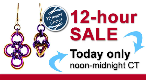
For May, you’re getting two projects in one with our Japanese Cross & Polyhedron Earring kit. Read more below!


For May, it’s a bonus two projects in one with our Japanese Cross & Polyhedron Earrings. These cute earrings are made even more fun with our brightly color anodized aluminum rings.  Follow the link below to customize this kit with your favorite color fade!

We will release this kit on May 15th in a 12-hour sale starting at noon CT. Make sure to join our mailing list for reminders about the sale and a link to the kit as soon as it is available.


Ask an Artist: Starting a Jewelry Brand

At the end of last year, Blue Buddha’s founder Rebeca Mojica made the leap to launch her own brand, focusing on her finished chainmaille jewelry.  In this post, she talks about why she decided to do this and offers tips for getting the most bang out of your branding, even if you’re on a shoestring budget.

Have another question for Rebeca on this topic?  Leave it in the comments, post it to our page on Facebook or send it in an email to [email protected]!


What made you decide to start the Rebeca Mojica brand rather than continue to sell as Blue Buddha?

Over the years, people have come to recognize Blue Buddha as a supplier of premium jump rings and instructions. The brand began as an artisan jewelry design company, but evolved into a jewelry supplier. When people hear the name Blue Buddha Boutique, they may think of innovative chainmaille designs, but they think in terms of “That’s something I can learn to make from Blue Buddha!” as opposed to, “I want to buy a completed version of that necklace!”Rebeca Mojica - chainmaille jewelry

I had been contemplating this move for a few years. What finally sealed the deal was an art fair I did in the winter of 2010. Every single day of the four-day show, people came to my booth asking to buy pliers. I realized the time had come to make the switch once and for all so that I could have a jewelry brand that could stand on its own.


Is it common for larger brands to have subbrands?

Large companies almost always have sub-brands and/or multiple “divisions.” Actually, it’s a little creepy how big some of the huge corporations are, once you add in all their holdings, but that’s another topic. *chuckle*

Quantum Rose - Rebeca Mojica

What is more common in the artisan world, is for a designer to have two or three brands, each serving a different market. For example, some jewelry designers create high-end pieces that sell in museum shops and luxury boutiques. However, they still wish to make pieces for the “masses.” Unfortunately, if they were to sell high-end items right next to much more accessible items, it could dilute the brand. Customers might be confused: “Is this a luxury brand, or not?” Worst-case scenario, the mixed-message could lead some customers to avoid purchasing items from this designer.


So the solution is to have a secondary brand, possibly even one that allows the designer to sell directly to the customer via craft fairs, a company website, or an online marketplace such as Artfire. The prices for this brand can be lower because the middle men, if there are any, take a much smaller percentage than galleries and reps, who combined can take much as 70% of the retail price. If artists were to sell both lines under the same name, then the galleries would likely feel as though they are being undercut because customers could simply go to the artist’s website and purchase a similar piece for half the price.

Having multiple brands allows the designer to create distinct product lines that appeal to different tastes and budgets. Additionally, some artists like to take more chances with subbrands, because if something “bombs” it won’t affect their meat-and-potatoes line. Some designers use a subbrand to support controversial causes or non-traditional lifestyles; they can do so without ostracizing their core customer base. I know more than a few artists who successfully sell their work under a couple of different names, each with their own branding, and each targeting a different market.

Where you at all nervous about making this switch?

Elemental Leaves - Rebeca Mojica

Truthfully, I was far more excited than nervous. It was like starting a business all over again, but with much more clarity and vision than the first time I started a business. I got to concentrate on all the fun stuff: new business cards! New logo! New tagline! The creative part of my brain loved it!

I was also reassured because I knew I already had a customer base; I wasn’t trying to start a jewelry line from scratch. I knew that having a jewelry business can be tough, and part of me half-expected to hear crickets chirping after we sent out our first official email announcing the Rebeca Mojica website. But instead, we were overwhelmed with emails of support … and of course, orders for jewelry! Yay!

How did you decide what colors would represent Rebeca Mojica brand?

First off, I knew I wanted nothing to do with the blues and lilacs that are associated with the Blue Buddha brand.  I figured if I was creating an entirely new line, it needed to be distinguishable. I wanted a palette of three basic colors so that we could mix and match for the website and other branding materials. From the three basic colors, each color would have one additional tint/shade that would be the exact same hue, just a lighter or darker version of it.

Gray was an obvious choice, because I work with metal. OK, one down.

Then, on to the difficult part of choosing another two colors to go along with the gray. Jenna, my marketing gal, and I read dozens of articles about color theory and choosing colors to represent brands. We read studies about what perceptions people had regarding colors (including A Guide to Choosing Colors for Your Brand and Colorize Your Brand). We looked at hundreds of photos of home decor in various color palettes. It was fascinating, but also easy to get a bit overwhelmed with analysis.

The next color we chose was a chocolate brown It is a good, neutral color, and to me, it’s also very organic. Even though I’m not making jewelry out of wood, I still think many of my designs have a real organic feel to them, and I am always inspired by the shapes I see in nature and the fractal-esque form of trees. The deepness of the color is elegant, as is much of my jewelry. It is also suitable to represent men’s jewelry, which is important because I plan on developing a men’s line later.

Having chosen two earth tones, I wanted just a splash of brightness to counter the neutral tones of the gray and brown. The deep red we selected represents the color used in my work. The way I use color is sometimes daring, sometimes whimsical, but almost always attention-grabbing. And the color red says all of those things to me. Also, I admit that I adore goth fashion and so red’s appearance in my branding wasn’t a complete surprise. *grin*

Once we had the basic colors nailed down, Jenna created a few different variations on the theme (okay, more than a few – see them to the right) so we could compare exactly which hues we liked best. Should the red be more on the orange side, or violet? What about the gray? Warm gray, or cooler, almost slate? We played around for a bit and settled on the final colors that you see on our marketing materials today.

As a post note, it’s funny that after we choose the colors (we ended up going with palette #3 – shown right), I later realized that the gray really had a huge blue undertone. “But I was trying to stay away from blue!” I agonized. Ultimately, though, after looking at other warmer shades of gray, I realized our shade really did work the best … and no one could possibly confuse it with the blues used in the Blue Buddha branding. So I had to let this one go, and I’m glad I did, because now I really love the colors of the Rebeca Mojica brand.

Do you think it’s important to have a logo? What if I’m not a designer, what should I do to create one?

If you are more than a hobbyist, and wish to earn actual income from your craft, then yes, having a logo is crucial. You’ll want to use your logo on your marketing materials–your website, business card, jewelry tags, care sheets, banners at shows, etc. If you have a clever, memorable logo, you’re more likely to get repeat customers. And if you do the same craft fairs year after year, you’re more likely to get new customers, too, for the simple fact that people will remember seeing your logo and work, and will feel as though they can “trust” you because you’ve been there for several years.

At this point in my business, I’m lucky to have Jenna as a full-time marketing person. With some input from me, she created the Rebeca Mojica logo and tagline, and created the clever interlocking circles above my last name (which I adore).  Obviously the vast majority of artisans will not have a full-time marketing person, or even a contractor, to handle a logo design.  We are, however, strongly visual people and many of us will be lucky enough to create a strong logo on our own.  Even if this is you, however, I do recommend eliciting feedback from friends, current customers, and peers whom you respect. Sometimes your vision doesn’t shine through in your logo, and you’re too close to it to notice a potentially humorous or confusing flaw.

If you can’t design your own logo, see if you have any friends or current customers that can do it for free, or in trade. When I originally did the Blue Buddha logo, I knew what I wanted, but didn’t have the skills to make it real, so I found a friend in design school who did it for me. The deal we worked out was $50, some beer and a piece of jewelry for his ladyfriend. Nine years later, that was money clearly well spent. :-) We still have a design credit to him on our website to this day.

If you don’t have any design friends, then try going to your local college–or if you’re really rural, try the local high school. Nowadays, many students can do amazing things on computers. Yes, you’ll have to spend money on this, but if you’re working with a student, your investment will be minimal, and sometimes a student might even be willing to do it for free (or in trade) in exchange for being listed on your website as a resource. With any luck, you’ll connect with an exceptional person with whom you can work with again later on other projects you may need.

If you have someone else create your logo, be sure to have some idea of what you want, and what you don’t want. Designers aren’t mind readers. If there are colors you want used, be sure to say so and to state why. If you feel specific motifs represent your brand, let them know. Bring in examples of fonts you like and fonts you don’t like. All of this will help the designer develop a logo that you like sooner, rather than later, and it can save you both much frustration.  If you have a really good idea of what you want your logo to look like, you can even try sites like 99 Designs where you describe your exact specifications and receive design ideas and quotes from tons of designers affiliated with the site.

Finally, make sure you have a couple of versions of your logo that can be used. I’ve found it is best to develop a square one as well as a horizontal one. That way, if your horizontal logo is too long for your jewelry tags, the square one may be perfect. This gives you greater flexibility with your promotional materials.

You are always great at making a big impact on a small budget. For crafters, what branded items do you think give the biggest bang for the buck?

1. Website (or logo if you are on an online marketplace, like Etsy or Artfire or even just Facebook) — in today’s age, you need to be online, and you need to make sure your brand shines though on every page of your site.  I used IndieMade to create my site and highly recommend them for folks who need their own website and want to be able to start selling things right way.

2. eNewsletter – It is never too early to start a newsletter. (My first mailing only went out to a list of 6 customers … but they didn’t know that!)  Some mailing list services like MailChimp even offer free plans for lists of less than 2,000 names.  Every time I do a mailing with a promotion, we get jewelry orders. Without fail. So what are you waiting for? Get to it!  (Click here to join Rebeca’s email list and find out when the next sale is!  Enter your email address and select “Rebeca Mojica Jewelry” from the list choices on the next page.)

3. Care Sheets – Care sheets can be super inexpensive–ours are simply 1/3 page double-sided black and white copies. If you put enough useful information on your care sheets, customers will keep them. Which means they’ll see your name over and over again, and every time they refer to the sheet, they’ll be reminded that you are a trustworthy source of information. Keep a digital copy of your care sheet online–this is useful not only for customers, but it can increase traffic to your website if other people are searching for how to care for an item.

Rebeca Mojica - Chainmaille Jewelry

4. Banners for craft shows – If you do shows, you need a banner to grab people’s attention. You want someone who is walking down the aisle to see your banner and think, “Man, I gotta get to that booth right away, even if I skip this next booth!” Make sure to have a banner that is displayed over your head, rather than hanging off your table. If you’ve got a crowd of people looking at your stuff (and you do want a crowd of people looking at your stuff, right?), then no one will be able to see your banner if the only one you have is on the table, hidden behind everyone’s legs!

5. Business cards — Note that business cards didn’t even make it into my top 3! That’s because we live in a digital age, and the paper business card is not as important as it used to be. Sometimes at craft fairs, people just go around gathering business cards…and then never look at them again. So you don’t need to spend a lot of money on your cards.  If someone is interested in your stuff and grabs your card, it doesn’t need to be the most spectacular thing they’ve ever seen. It just needs to have enough information (including images) to remind them what you make, and then they’ll probably just go to your website anyway… and then throw away your card.  If you don’t have a designer, using a site like Moo cards can make the post of the images you do have along with your logo (they also have lots of modern premade designs to choose from!)


What can we expect from Rebeca Mojica brand jewelry as you continue to develop its new identity?

I’m looking to dive more into the Japanese family of weaves. I’ve already started creating several pieces that will make up the Bubble collection…essentially large statement pieces with lots of white space that look like, well, bubbles! I’m looking to develop a few new lines at different price points. And, I plan to come up with 1-2 haute couture pieces (think Poseidon’s Embrace) each year. There’s a few ideas for chainmaille clothing that have been tugging away at my brain for a few years, so I expect they’ll start to take shape–literally–over the next couple of years.

I probably won’t get too deep in making many new jewelry designs for about a year and a half, as I’m about to start work on a second instructional book, and that is going to take quite a bit of my attention. (Hmm, not to mention being preoccupied with opening up a new retail space for Blue Buddha Boutique … ) However, as soon as the second book is finished, lookout! Because then I’m all about making new designs! In the meantime, though, there are a lot of pieces I’ve made and sold at shows, but have never put online. Each month, we’ll be adding several of these to RebecaMojica.com, which means there will still be plenty of eye candy for you!