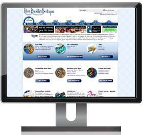
 We are so excited to be unveiling our website facelift! A new look has been a long time coming and we hope you’ll love our updated style as much as we do. Although this site update is largely cosmetic, there are a handful of changes to the organization of our site and the ways you can navigate it. This blog post will address some of the changes we made to help familiarize you with our new-ish site, however, feel free to contact us with questions if we missed anything.
While this new look is a lot of fun, we are still planning a major site overhaul at the end of this year into the beginning of 2012. Some of the changes we made now will stay and some will change yet again. At this stage, we really want to hear from our customers about what is working, and what isn’t. One of the great things about our major site overhaul is that we get to start with a much cleaner slate and your input will help us know how to begin piecing together the ultimate shopping experience and chainmaille resource.
Our Website Feedback Survey is now closed but we still want to know your thoughts about our website. Leave a comment, write on our wall on facebook, send us a tweet or email us at [email protected] and most importantly, look for a longer survey in the months ahead that will give you the chance to tell us your complete wish list for B3’s new website.
===========================================================
NEW MENU + SUB-MENUS

Our main website navigation still lives in basically the same place as the old one but we think this one is lots more fun (check out the fun jump ring animation! We’ve been playing with it nonstop, too *wink*) and much easier to see and use. Simply click on the page you’d like to visit.
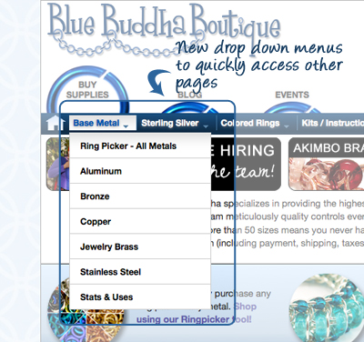 We also added a new sub-menu in the blue bar right underneath the main menu. If you see a little arrow, you can roll over the sub-menu item and see a dropdown of quick links to individual pages. Want to jump right to the Aluminum page? Now you can.
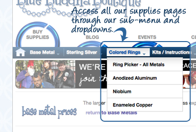 The sub-menu for each main menu item will remain in the blue bar no matter what page you go to so there is no need to go back to the main page. For example, let’s say you’re in the “Buy Supplies” section and want to jump from the Aluminum page to the Niobium page, you’re just one click away! Roll over “Colored Rings” in the sub-menu and click on “Niobium” and you’re there! No need to go back to the main supplies page to get there.
OTHER NEW FEATURES IN THE PAGE HEADER

You can always access our home page by clicking on our logo or by clicking the home icon. In addition, access your cart or our contact information by clicking the corresponding items in the upper-right hand corner of the header. You can also use the search bar to search our site by using keywords like “Aluminum” or “Chained book”.

NEW SUPPLIES PAGE
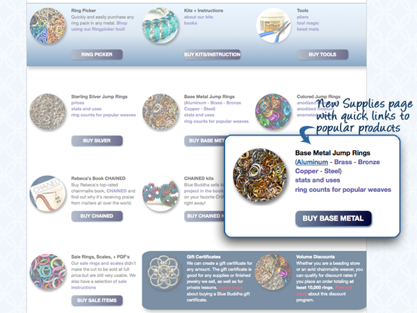
We think our new supplies page is clearer and much more user friendly. From this page, you can access each category of supplies that we sell. We added quick links to popular products/pages as well to get you to what you need even more quickly.
NEW BASE METALS PAGES
We rolled out our new base metals pages a while ago but there are still a few features that are worth pointing out.
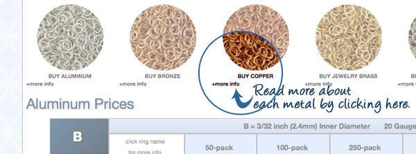
Want to learn more about a certain metal? Click on “more info” to read more about that particular metal so you can design which one is perfect for your project.

Near the top of every base metal page, you’ll see a list of letters. If you know the size you need, you can click on the corresponding letter (for example “L” if you were shopping for size L18) and jump down the page to that size. Once you’re there, click on the ring size for stats and uses and/or jump to the same size in a different metal using the links below the table.

SLIGHT CHANGES TO OUR KITS PAGE
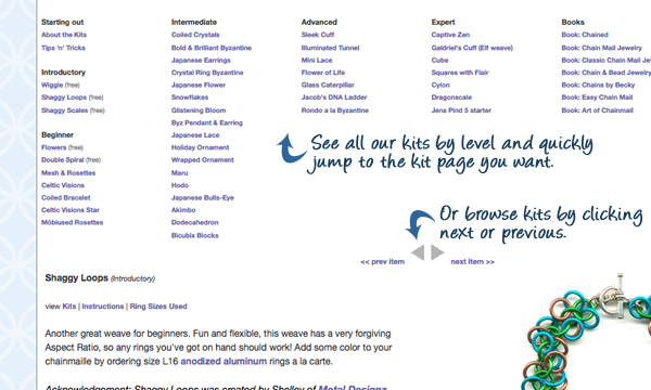
At the top of every individual kit page, you will see a pretty large menu that lists all our kits by level. You can jump right to the kit you want by clicking the link for its page. If you’re not sure what you want, you can browse through kits by using the Previous and Next arrows. The kits will appear in order of skill level as you browse so just keep an eye on the level in the parenthesis next to the kit title to make sure you are getting the right kit for you.
NEW HELP SECTION
Our help section includes our FAQ as well as cool links, resources, and articles from past B3 newsletters. If all else fails, visit our contact page and let us know your question so our customer service folks can help you.

===========================================================
Now it’s your turn to let us know what you think. Spend some time clicking around the site and then share your thoughts by filling out our survey. The survey is 8 questions and will take about 5-15 minutes to complete. Thank you again for your time and feedback and don’t forget to enter to win a B3 gift certificate!


Thanks, Siouxsie!